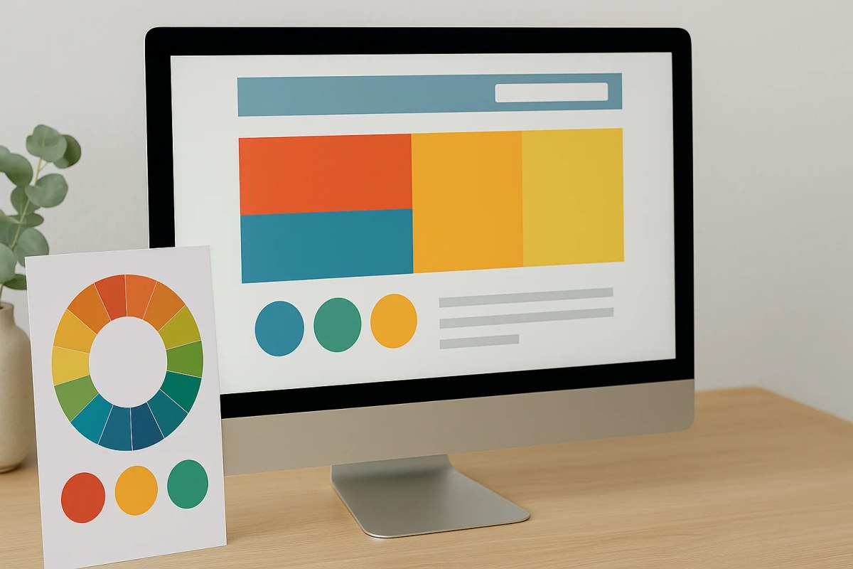
Colour influences how a website feels, but not in a universal or predictable way. Associations depend on context, brand, culture, contrast and the combination with typography and imagery. Use colour deliberately without treating colour psychology as a set of fixed laws.
The psychology of colour in web design
A visitor lands on your website and forms an opinion in less than a second. Before they read your headline, before they see your services, before they find your contact button.
Colour is one part of that first impression alongside layout, imagery, typography, copy and brand recognition.
It's not decoration. It's communication. And on the Costa Blanca, where your visitors might be Dutch, British, Spanish, or German, colour communicates something slightly different to each of them. Getting it right matters.
What colours can communicate
Colours can trigger associations, but those associations are not fixed. The same colour can feel very different in another sector, culture or combination. Treat general colour associations as design inspiration rather than proof that a visitor will automatically feel a certain way.
Blue is common in banking, insurance and professional services and can therefore feel familiar, calm or trustworthy. That does not automatically make blue the best colour for B2B or legal services; brand identity, contrast and context still matter.
Red is visually strong and can create energy or emphasis. In some contexts it may feel urgent or warning-like, while in others it can feel warm or premium. Judge the complete combination rather than treating red as a default 'urgency button'.
Yellow and orange can feel lively, warm or playful depending on shade, saturation and combination. They are not inherently the right choice for hospitality or creative businesses simply because those sectors often use them.
Green is often associated with nature, health or sustainability, but different shades can also feel luxurious, financial or traditional. Context determines the association.
Neutral tones (white, light grey, warm beige) create space and let other elements breathe. Real estate websites on the Costa Blanca often benefit from neutral backgrounds: the property photos do the talking, the design stays out of the way.
The mistake most businesses make
They sometimes choose mainly on personal taste without checking whether the palette fits the brand, content and readability. The problem is not one 'wrong psychological colour', but a choice that has not been considered as part of a system.
A luxury villa rental on the Costa Blanca may make different visual choices from a family activity centre in Benidorm. That difference comes from positioning, photography, typography and colour together, not a fixed formula for 'premium' or 'welcoming'.
The question to ask isn't "do I like this?" It's "how does this make my ideal client feel when they land on my site?"
Contrast and consistency matter as much as the colours themselves
Good contrast between text and background isn't a design preference. It's a readability requirement. Low contrast makes text hard to read, and hard to read means people leave.
Consistency helps visitors recognise patterns. Primary actions should therefore be recognisable, but not every button or section heading has to use exactly the same colour. A good design system uses consistent roles and sufficient contrast while allowing hierarchy.
A practical approach
Pick one primary colour that reflects your brand and your audience. Add 1 or 2 accent colours that complement it without competing. Keep the rest neutral.
Tools like Adobe Color and Coolors help you find combinations that work together. But no tool replaces the judgement call: does this feel right for this business, in this market, for this client?
That's why colour decisions are part of every site I build on the Costa Blanca. The palette comes after understanding the business and the audience, not before.
If you want to talk through what a colour palette for your specific business might look like, send me a message on WhatsApp.
Read more: