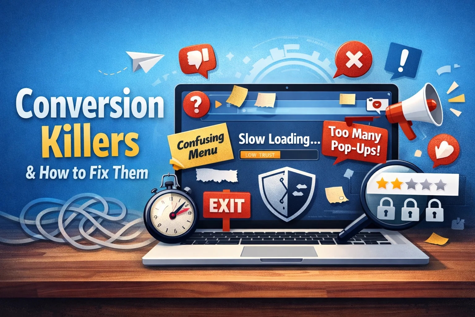
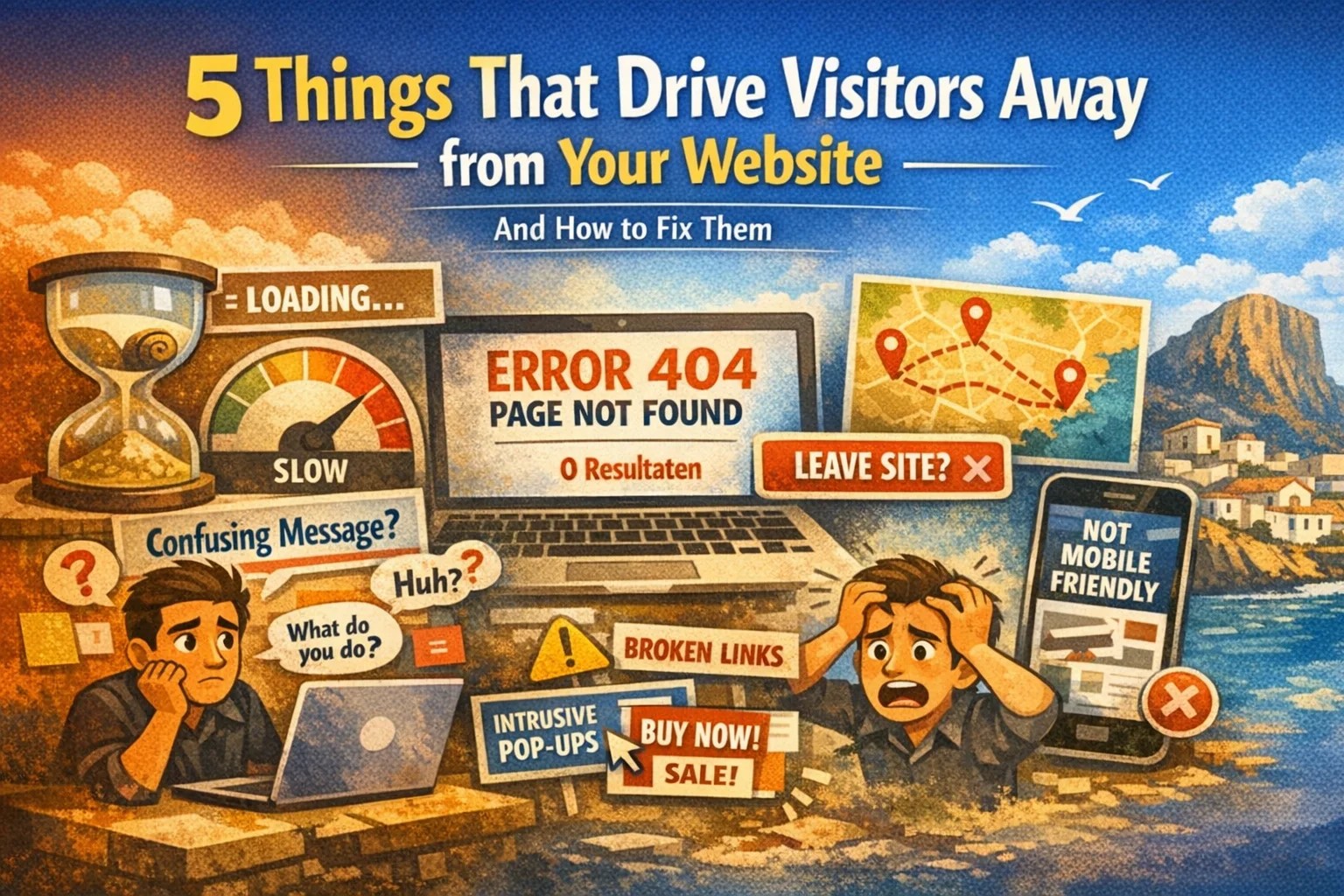
5 Conversion killers on your website and how to fix them

In 2026, people expect immediate clarity and speed online. First impressions matter. If a visitor does not understand within five seconds what you offer and why you are trustworthy, the opportunity is gone.
Many business owners have a visually appealing website but still generate very few customers through it. In most cases, this is caused by one or more “conversion killers”: hidden issues on the website that make visitors leave before taking action.
Below, we discuss five common conversion killers and how to fix them, so your website becomes more convincing and generates more conversions.
1. Slow loading time
No one likes to wait. If your website loads slowly, impatient visitors leave before they even see your content. A slow site feels unprofessional and frustrates users. Google also favors fast websites, so poor loading speed can hurt your search visibility as well.
Research shows that after just three seconds of loading time, more than half of mobile visitors abandon a page. Those potential customers are gone before they have even seen your offer.
Solution
Make sure your website is as light and fast as possible. Compress images before uploading them so they are not unnecessarily large. Remove or minimize heavy elements such as autoplay videos and unused plugins. Invest in fast hosting and use caching to speed up repeat visits.
Free tools like Google PageSpeed Insights show exactly which elements slow down your website and provide concrete recommendations to improve performance.
One of the biggest conversion killers is a slow site; learn how to make your site faster by limiting the number of plugins and learn about website facts
2. Unclear message
Visitors should immediately understand what you offer and why it matters to them. If your message is vague or generic, such as “welcome to our website,” potential customers quickly lose interest. An unclear homepage is like walking into a store without knowing what is being sold.
Online attention spans are short. You only have a few seconds to communicate your value. If visitors do not feel addressed, they leave before any real engagement starts.
Solution
Create focus in your communication. Be clear about who your target audience is and which problem you solve for them. Write a short, strong message, preferably visible at the top of your homepage, that clearly explains what you do and why visitors should choose you.
Avoid jargon and vague marketing language. Keep your copy personal, concrete, and specific. Add a clear call to action, such as “Request a quote” or “View our services,” so visitors know exactly what step to take next.
3. Confusing navigation
A good website works like a clear roadmap. Visitors should find what they are looking for without effort. If your menu structure is illogical or important pages are hidden, visitors get lost.
Too many menu items or unclear labels only increase confusion. The result is predictable: people give up and leave without taking action. Every extra click or moment of doubt increases the chance of abandonment.
Solution
Keep your navigation simple and logical. Limit the main menu to essential pages such as Home, Services or Products, About, and Contact. Use clear, familiar terms instead of creative labels that visitors do not understand.
Make sure important information can be reached within two clicks. Visitors should never have to search for contact details or pricing information. Test your navigation with someone who does not know your website. If they immediately understand where to click, your structure works. Clear navigation guides visitors naturally toward conversion.
4. Distractions
Flashing banners, autoplay videos, intrusive pop-ups: too many distractions pull attention away from your core message. When everything demands attention, visitors do not know where to focus.
Overcrowded pages feel chaotic and reduce clarity. Research shows that 38 percent of users leave a website if the layout is unattractive or confusing. Too many stimuli can overwhelm visitors and cause them to abandon the page.
Solution
Less is more. Define one primary goal per page and remove anything that does not support it. Use white space and a clean layout to create calm and structure.
Limit the number of call-to-action buttons and focus on one clear action. Use pop-ups and banners sparingly and only when they add real value. Structure your content with headings and short paragraphs so it is easy to scan. This helps guide visitors toward the action you want them to take.
5. Lack of trust
A website that does not feel trustworthy rarely converts. If your site looks unprofessional or lacks essential information such as contact details, an About page, or customer reviews, visitors hesitate.
Research shows that 75 percent of consumers judge a company’s credibility based on its website. If your website feels unreliable, trust is lost before visitors even consider contacting you.
Solution
Reassure visitors and show proof of credibility. Clearly display your contact details, including address, phone number, and email. Explain who you are on an About page and show the people behind the business.
Add customer reviews or testimonials to provide social proof. Display relevant certifications or trust marks where appropriate. Make sure your website looks professional, is free of spelling errors, and uses a secure HTTPS connection. Show that real people stand behind your business and that you have nothing to hide.
Small improvements can make a big difference. By removing these five conversion killers from your website, you significantly increase the chance that visitors become customers and get more value from your online presence.


